Digital Transformation for Premium Real Estate Brand
We turned a website redesign request into a strategic digital transformation for Ciudad Cayalá.

Client & Context
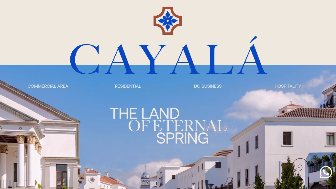
Ciudad Cayalá is an urban district in Guatemala City that blends residences, offices, boutiques, dining, parks, and cultural venues. More than a real-estate agency, Cayalá curates the whole experience: pedestrian-first streets, consistent safety and cleanliness, heritage-inspired architecture, and year-round events.
We conducted a series of interviews and discovered that a large share of the audience consists of English-speaking buyers, tourists, and business owners from the premium segment.
So they needed a luxury design and an English interface.
About Cayalá
Goals
- 1Reorganize the site around three audiences: tenants, visitors, business owners.
- 2Make the site a real sales tool.
- 3Close the language gap with a full English version.
- 4Give visitors practical information.
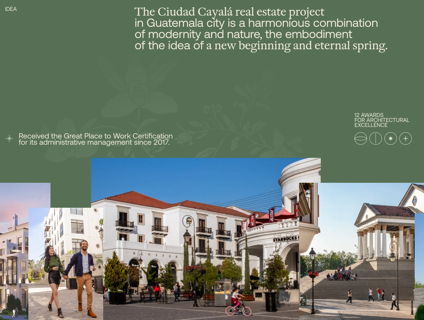
Brand Idea
Challenges
- Navigation and usability issues discovered in interviews.
- Missing English content for key target customers.
- Lack of actionable venue information.
From audience research to UI
Research & Audience Model
We interviewed representatives of all three segments to map tasks, pain points, and content needs; the findings guided IA and copy priorities.
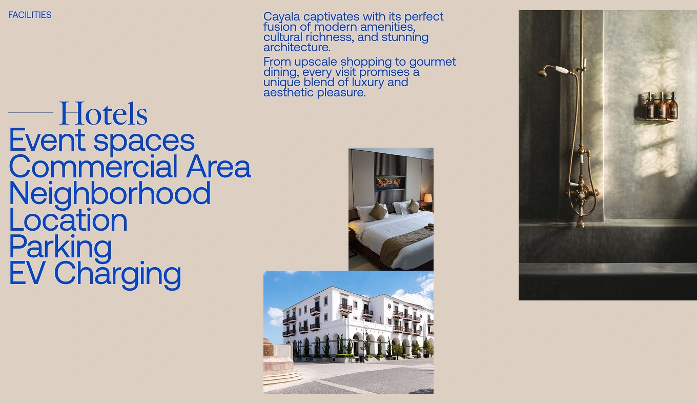
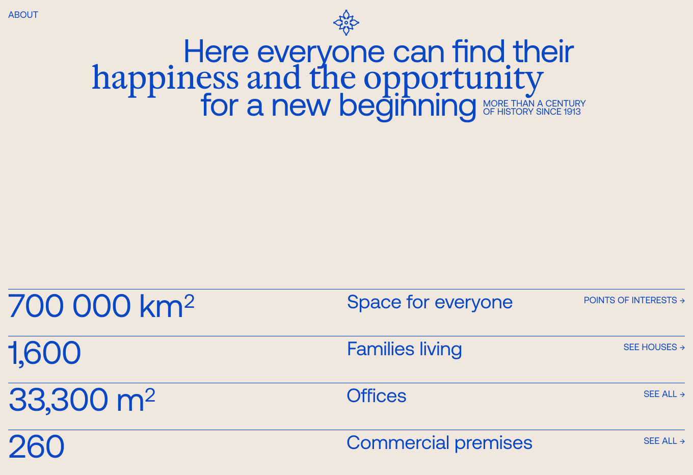
Cayalá’s facilities
Information Architecture
We split the experience into three clear sections — tenants, visitors, business owners — so each audience can reach relevant flows and content faster.
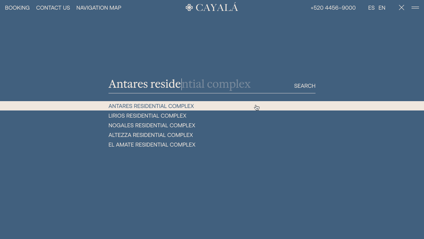
Search page
Buyer Journey Redesign
For apartment buyers, we structured a path through sales materials to a qualification form that captures needs and matches prospects to suitable apartments.
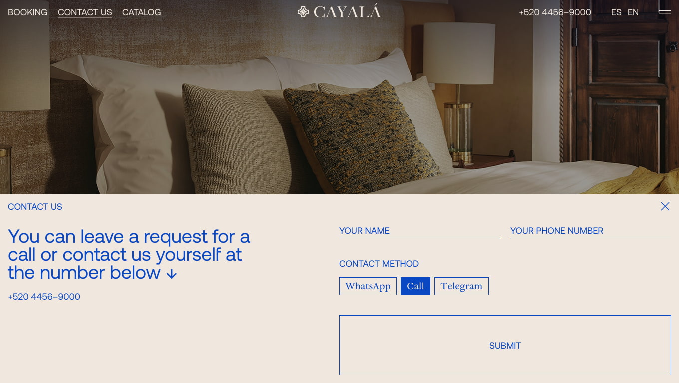
Contact form
English language
As most of the target audience did not speak Spanish, we introduced a full English version to remove a key barrier.
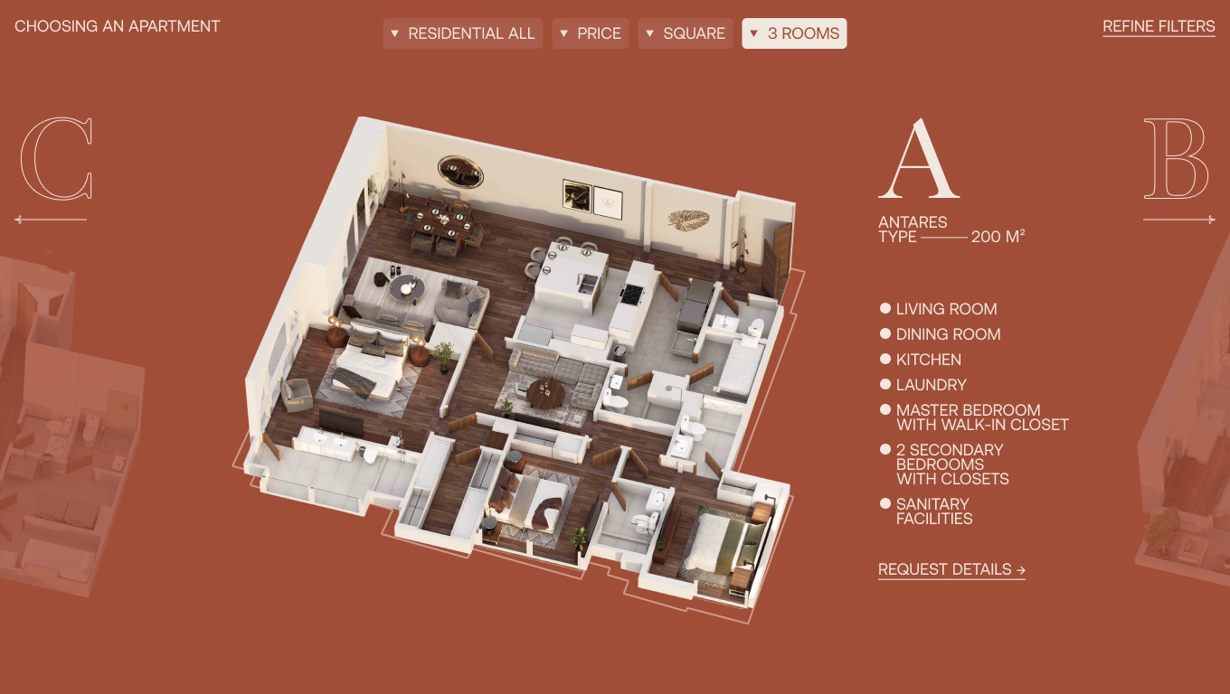
Choosing an apartment in English
Visitor Utilities
We added an interactive map so visitors can locate and learn about all businesses and services — e.g., restaurants, shops, churches.
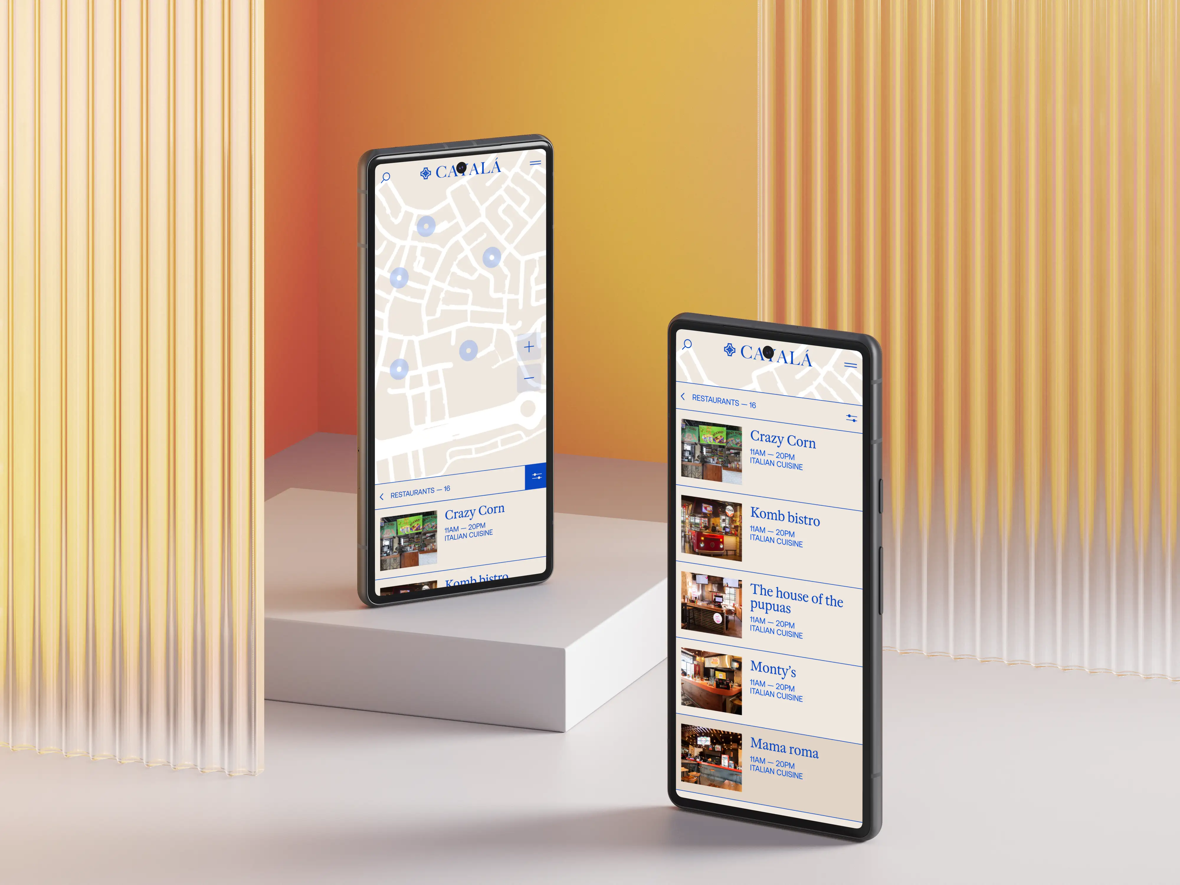
Mobile version of interactive map
Visual Language
The palette draws from Cayalá’s nature-linked identity: spring sky, ivory, redwood, coniferous forest, charcoal. UI accents reference Guatemala’s national flower, the White Nun Orchid, to express brand prestige with modern warmth.
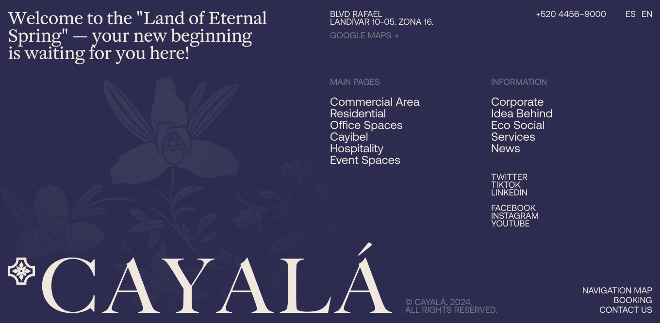
Footer
Risks & How We Mitigated Them
Missing the deadline
Mitigation. We fixed a short, weekly milestone rhythm and only moved forward after each milestone was approved.
Decision bottleneck. Design/dev blocks while waiting for feedback
Mitigation. We booked fixed review windows and applied a “silent approval after 48 hours” rule for non-critical items.
Late content. Key pages can’t be finished on time because materials arrive late or incomplete
Mitigation. We set a content tracker with owners and deadlines, and used clearly marked placeholders.
Compliance & Security
Results
We created a site concept that reflects Cayalá’s premium positioning while serving practical needs of buyers, visitors, and businesses. An English version was introduced to align with the audience’s language profile. The visitor experience strengthened with an interactive map and complete venue information.
See also

First Digital Storefront for a UAE IT Hardware Supplier
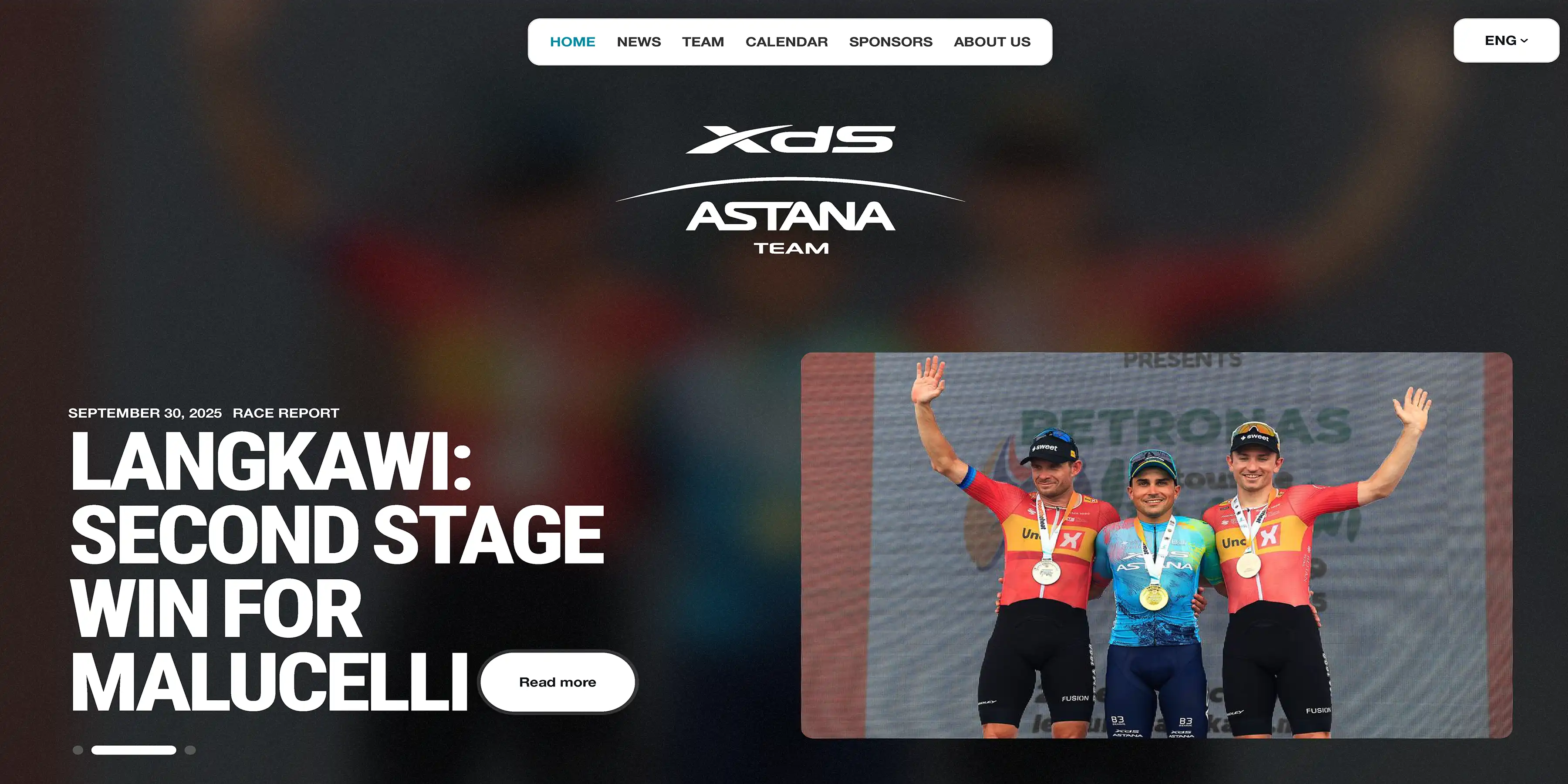
Top-5 UCI WorldTour Team's Corporate Website
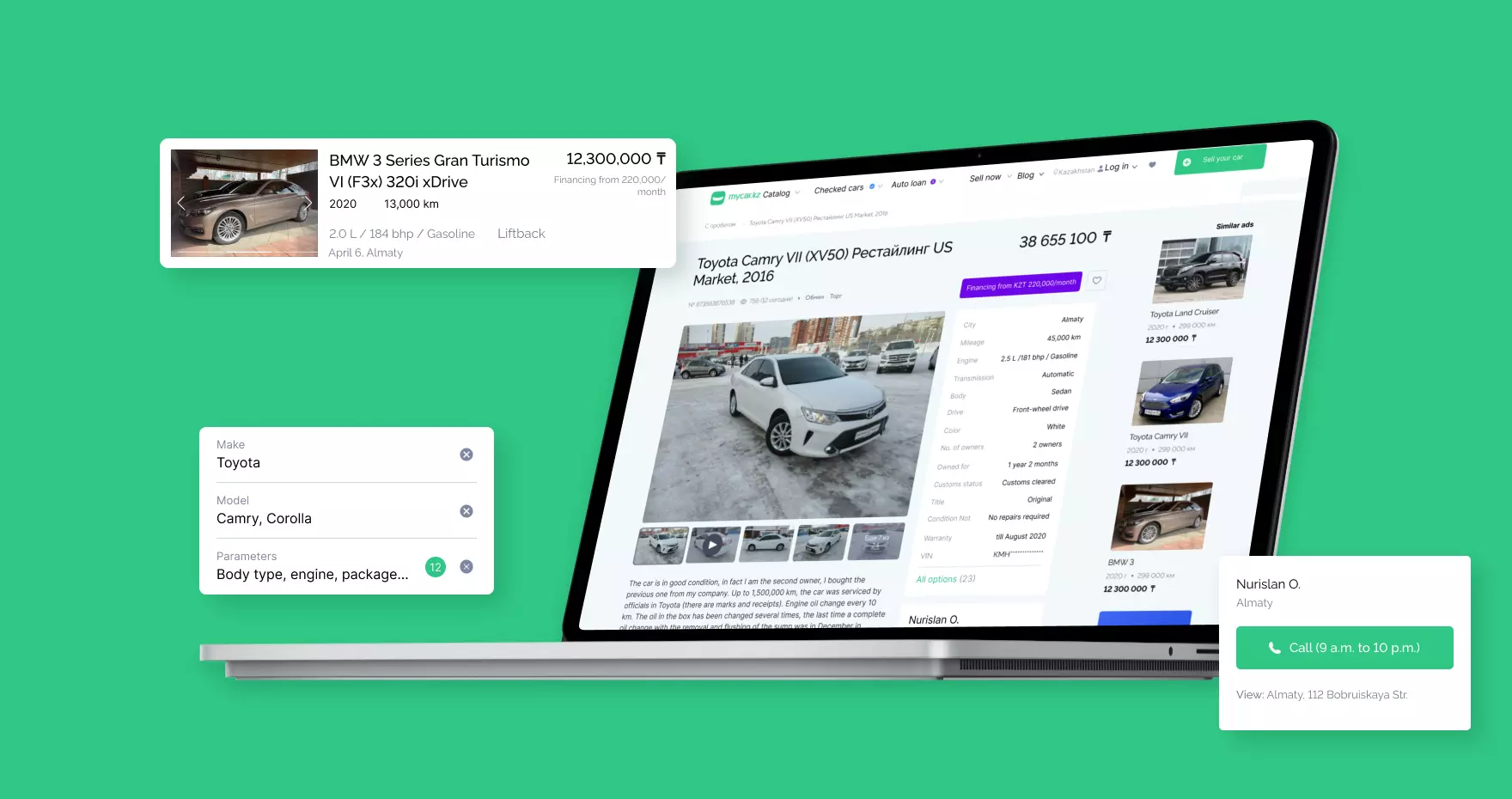
Kazakhstan's #1 car classifieds platform from Scratch
426,000 Active Sessions in Four Months for Financial Services App

Dealer Quality Analytics Platform for Mercedes-Benz